

Last year I got the chance to work with Pumpkin Studio, Mumbai and be in the part of the R&D process, style frames, technical department and animation.
Using the idea of lines, dots and pixels we created this resolve and other graphics system.
This was my first ever channel show package project and I was damm exited about it. 😍
Using the idea of lines, dots and pixels we created this resolve and other graphics system.
This was my first ever channel show package project and I was damm exited about it. 😍
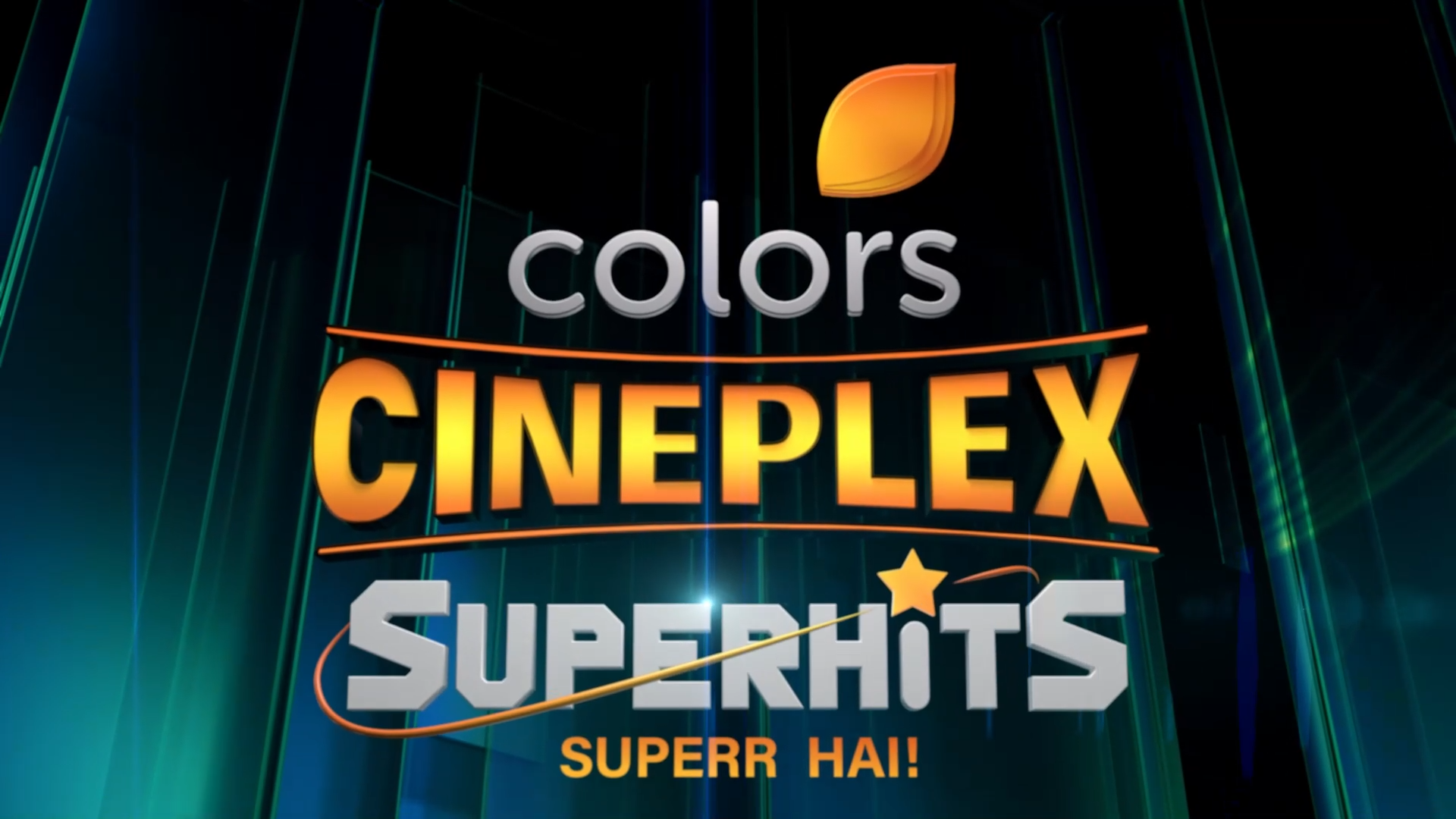
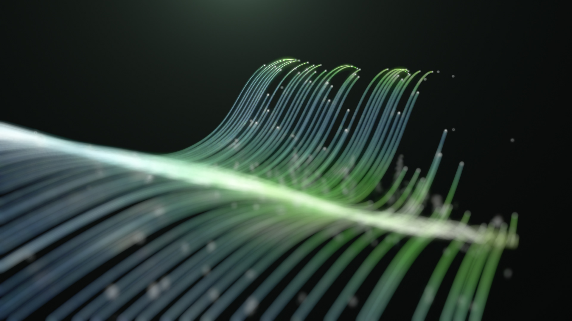
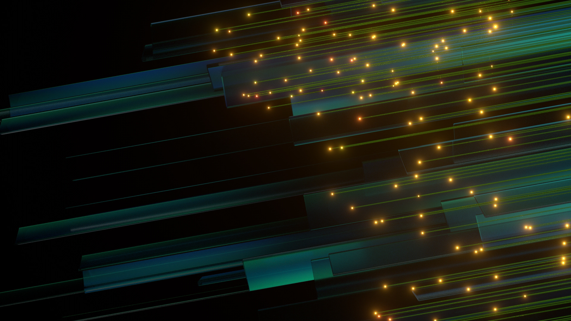
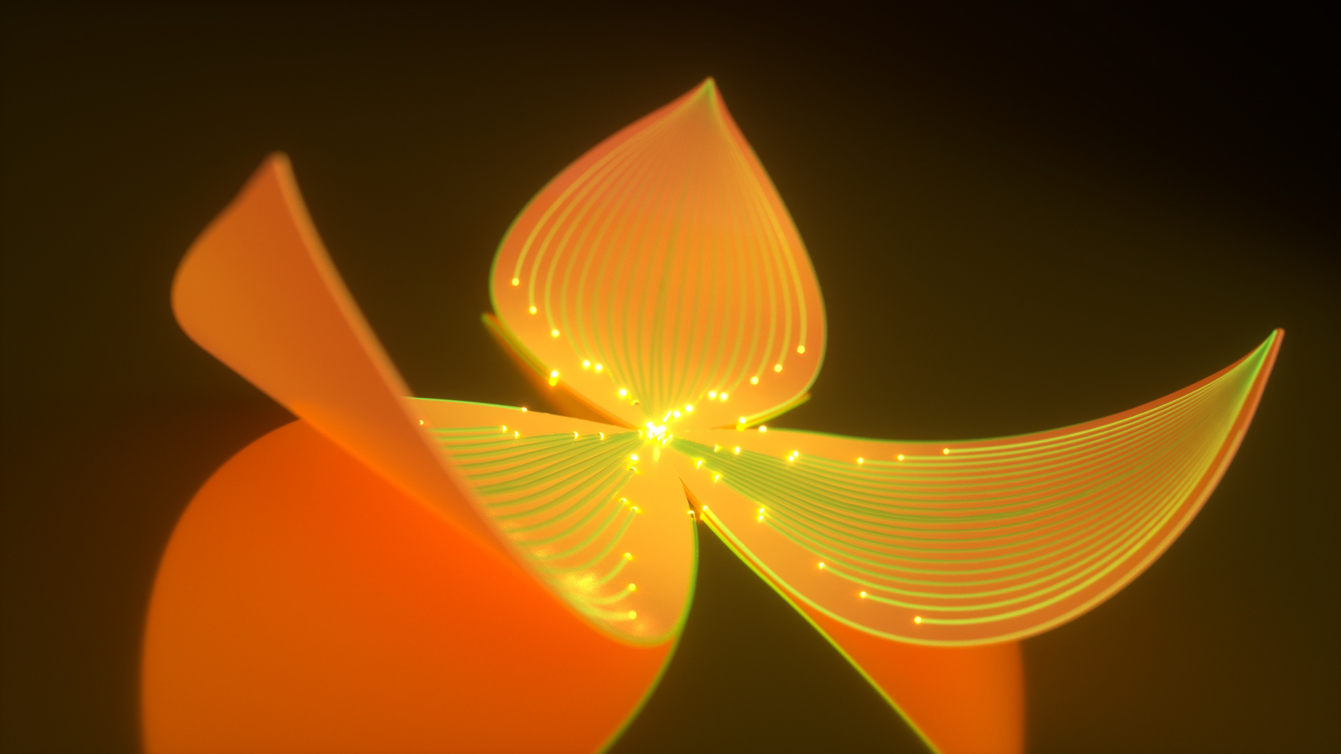
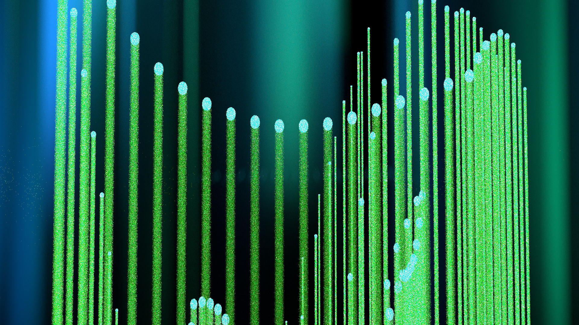
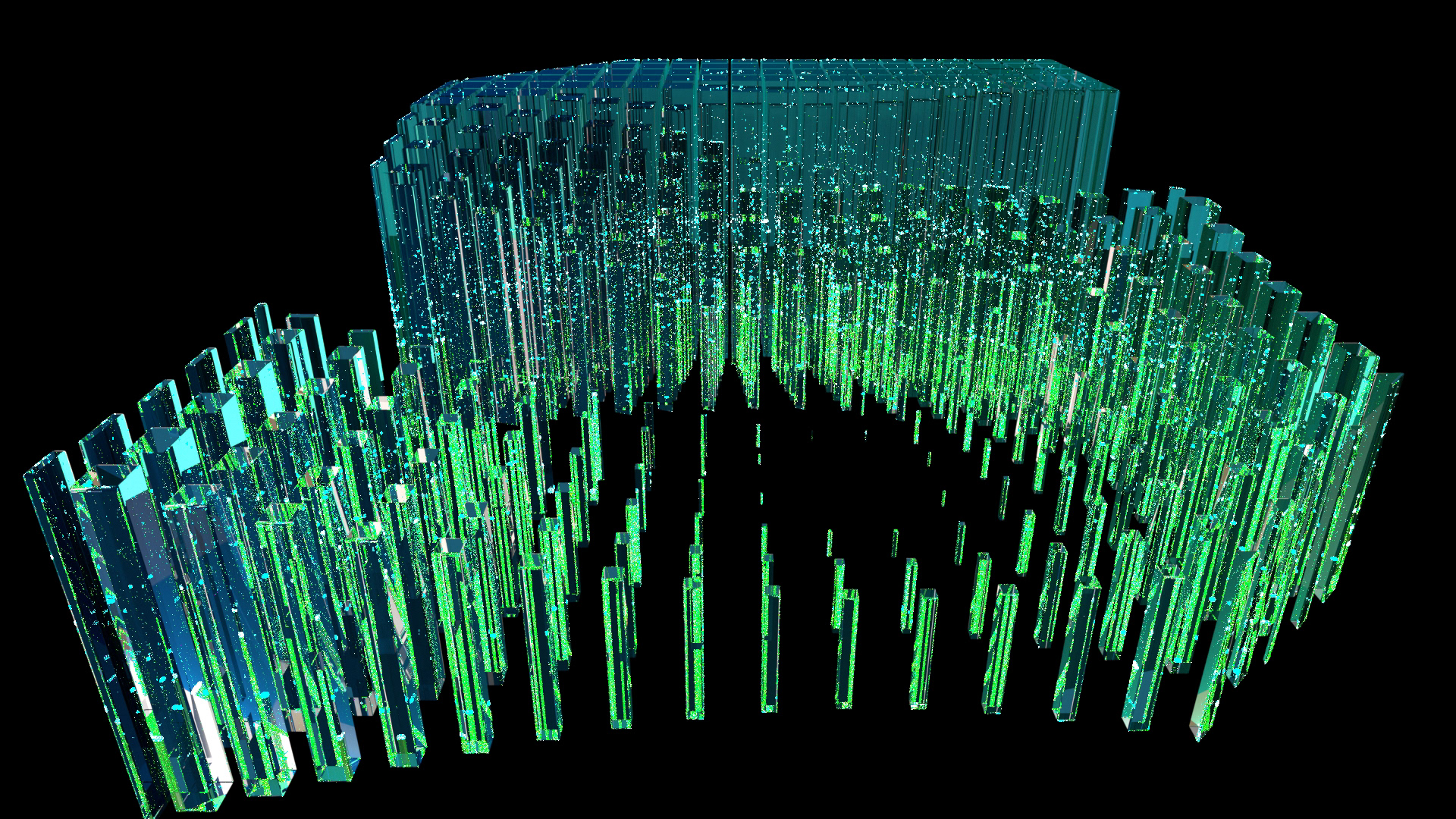
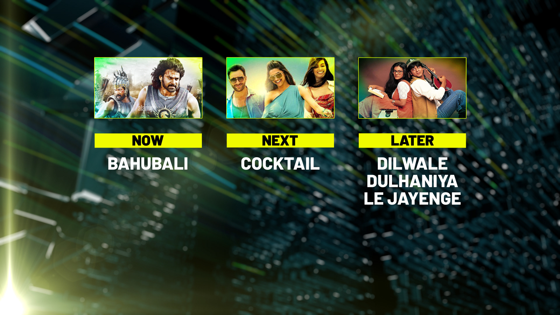
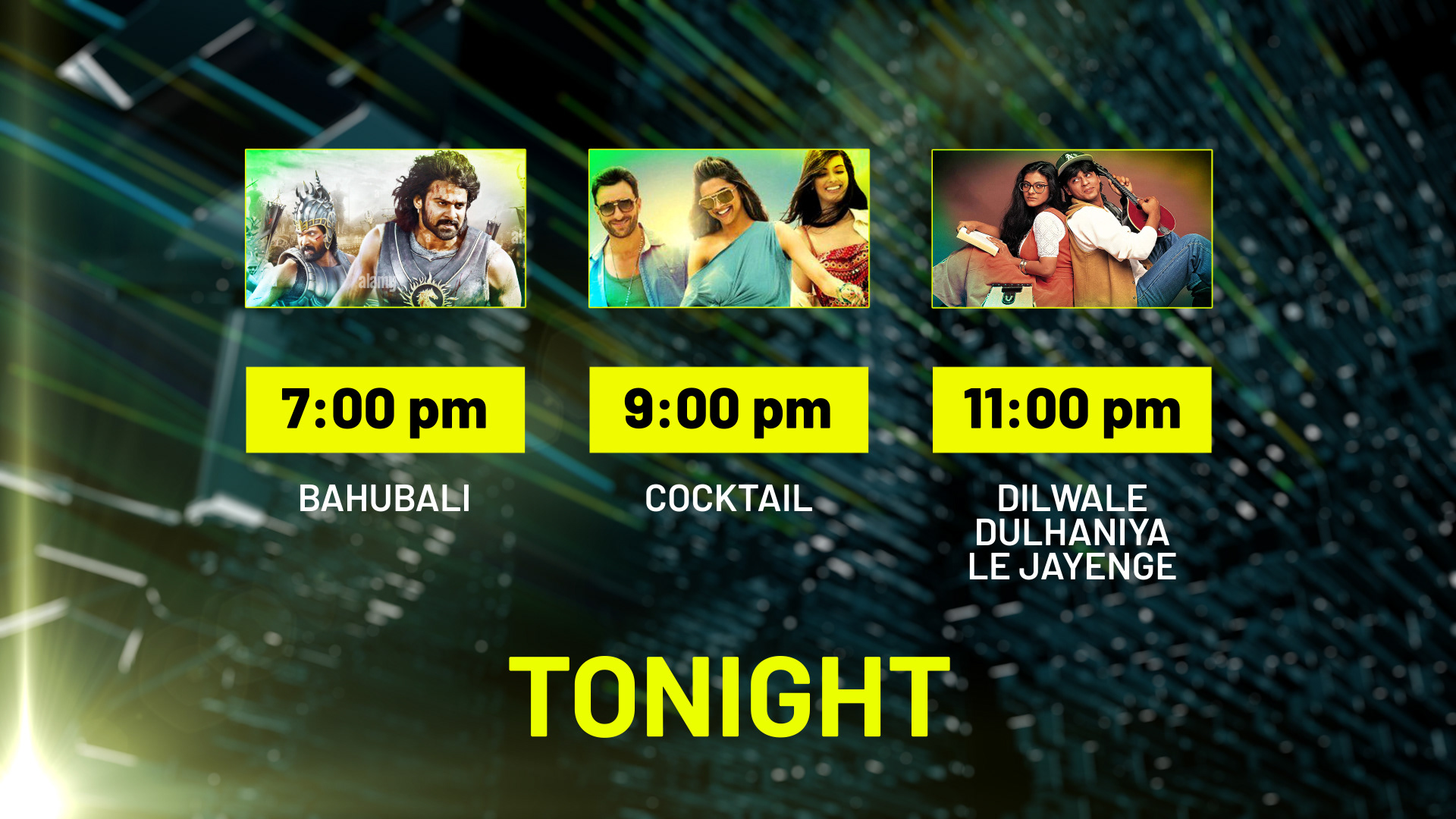
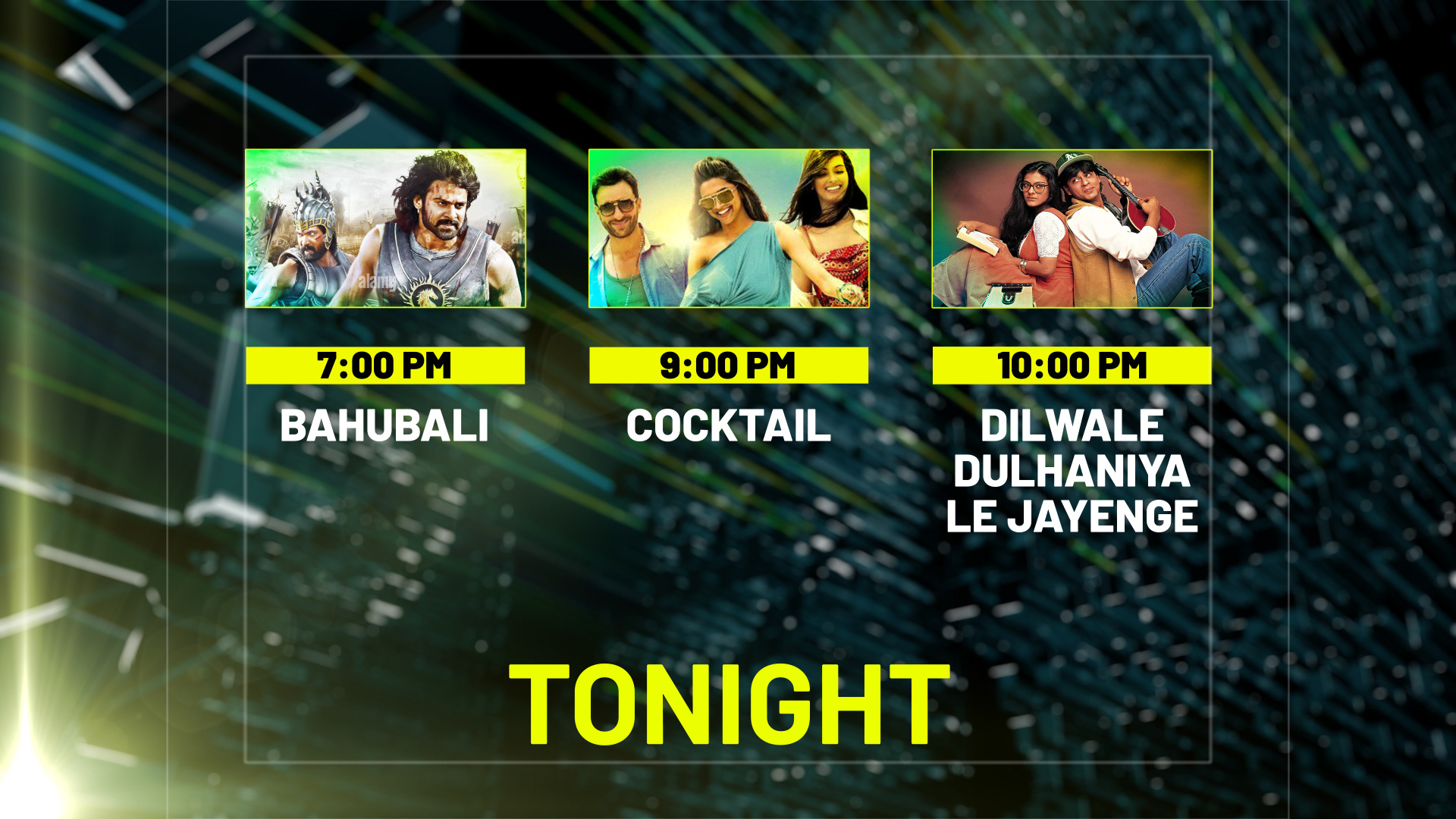
Final Frames
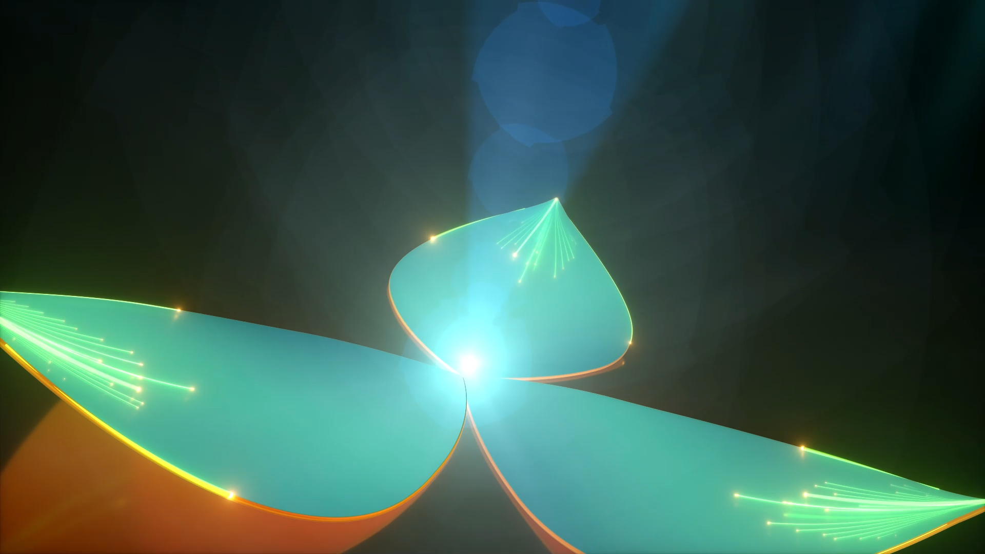
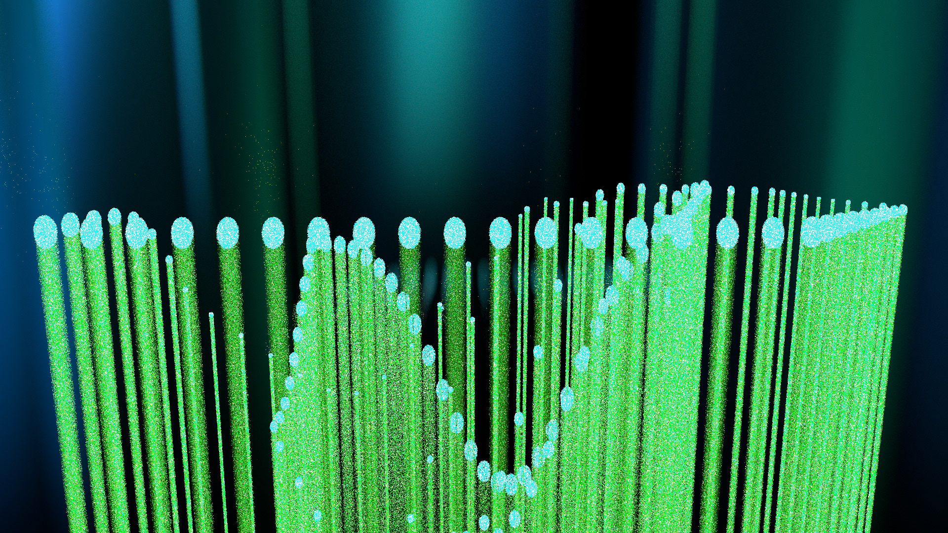
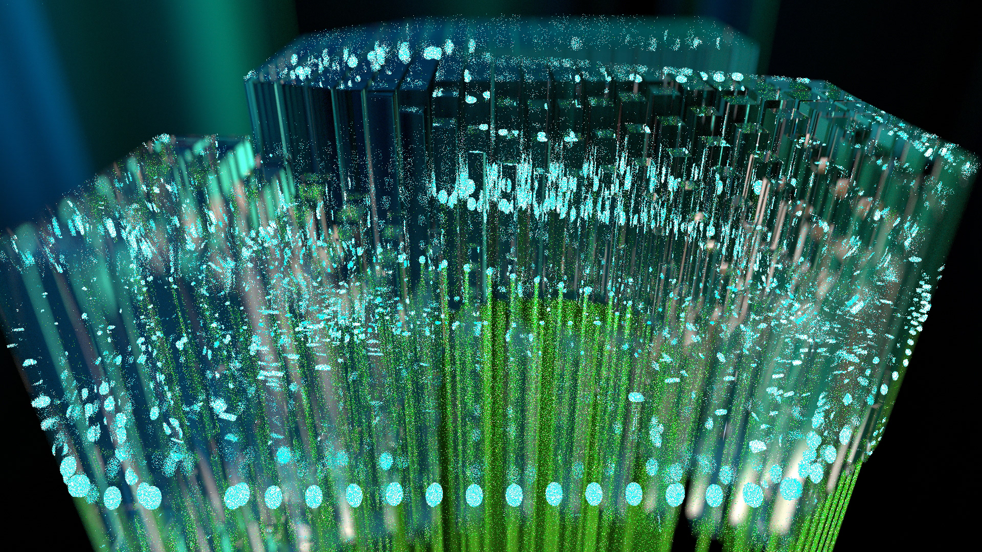
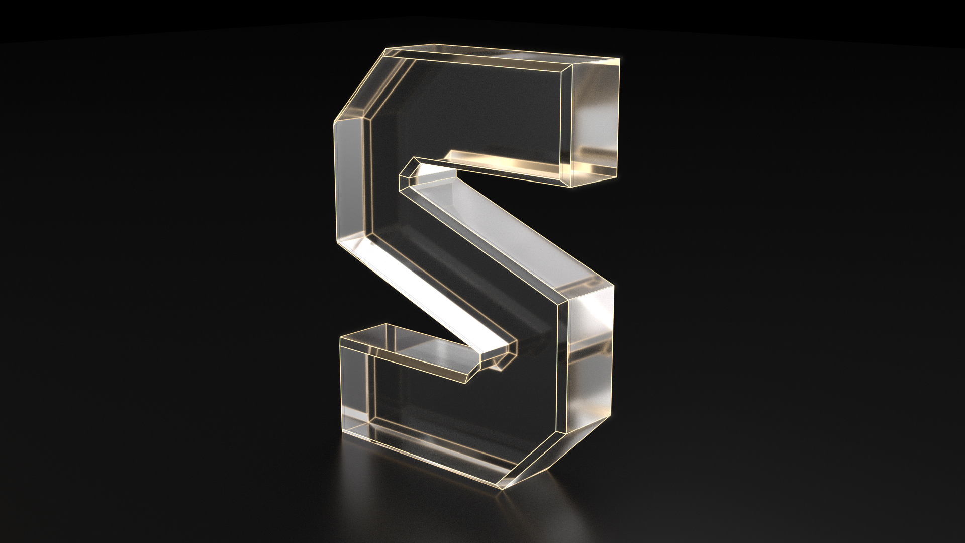
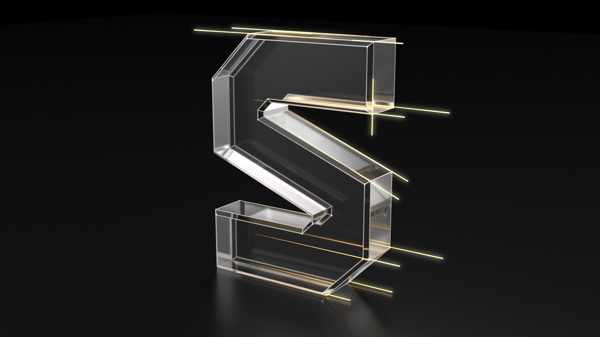
Reference Board - We picked out the neon, glow in the dark look for the ident as a base. Taking that we explored many looks and landed with a combination of curved and straight lines. The concept behind the letter formation was to make the letter build up from a source (in this case it was the lines and dots) making them into pixels cubes (because it's television) and the pixels fills up letter in a complete block.
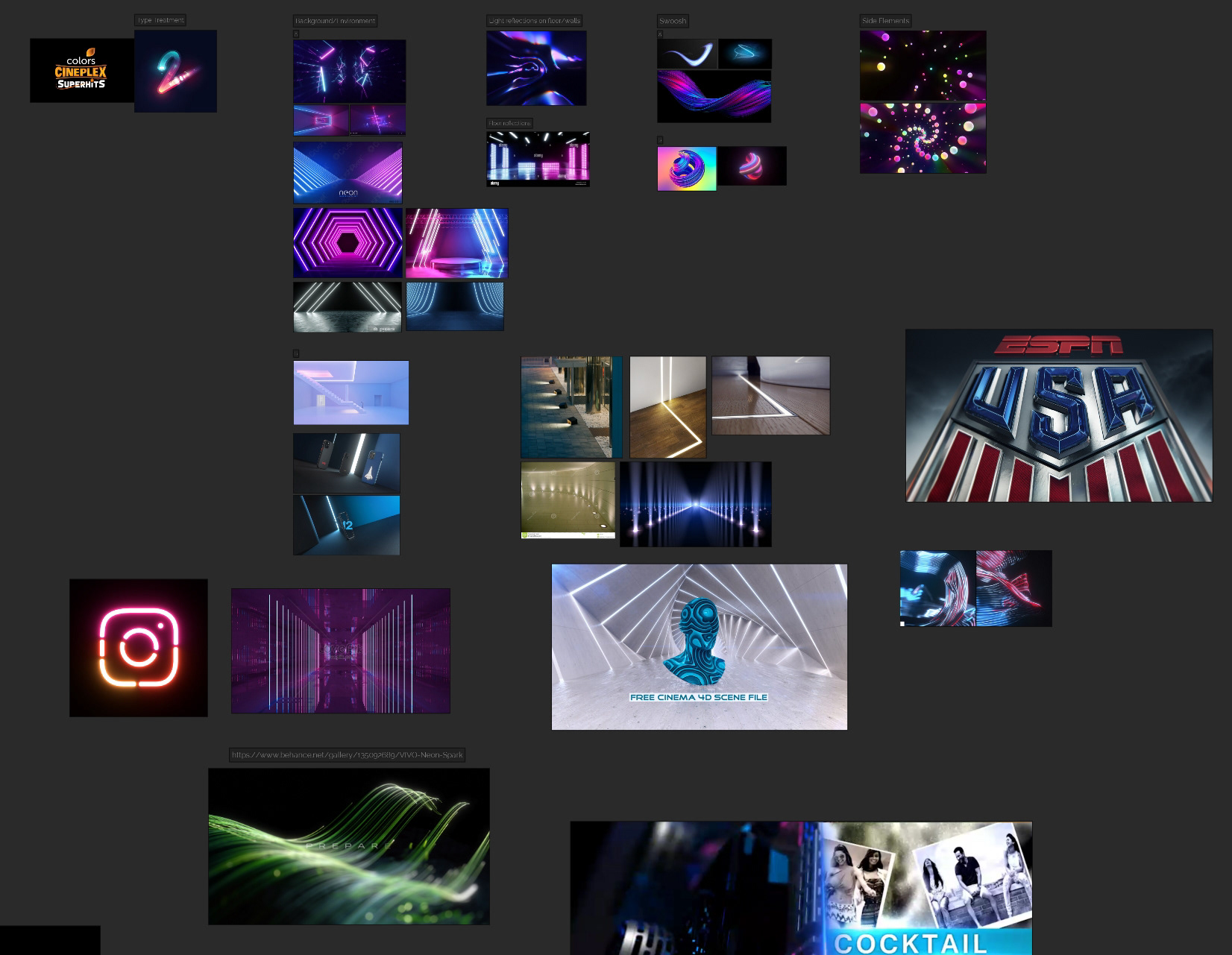
The R&D Process
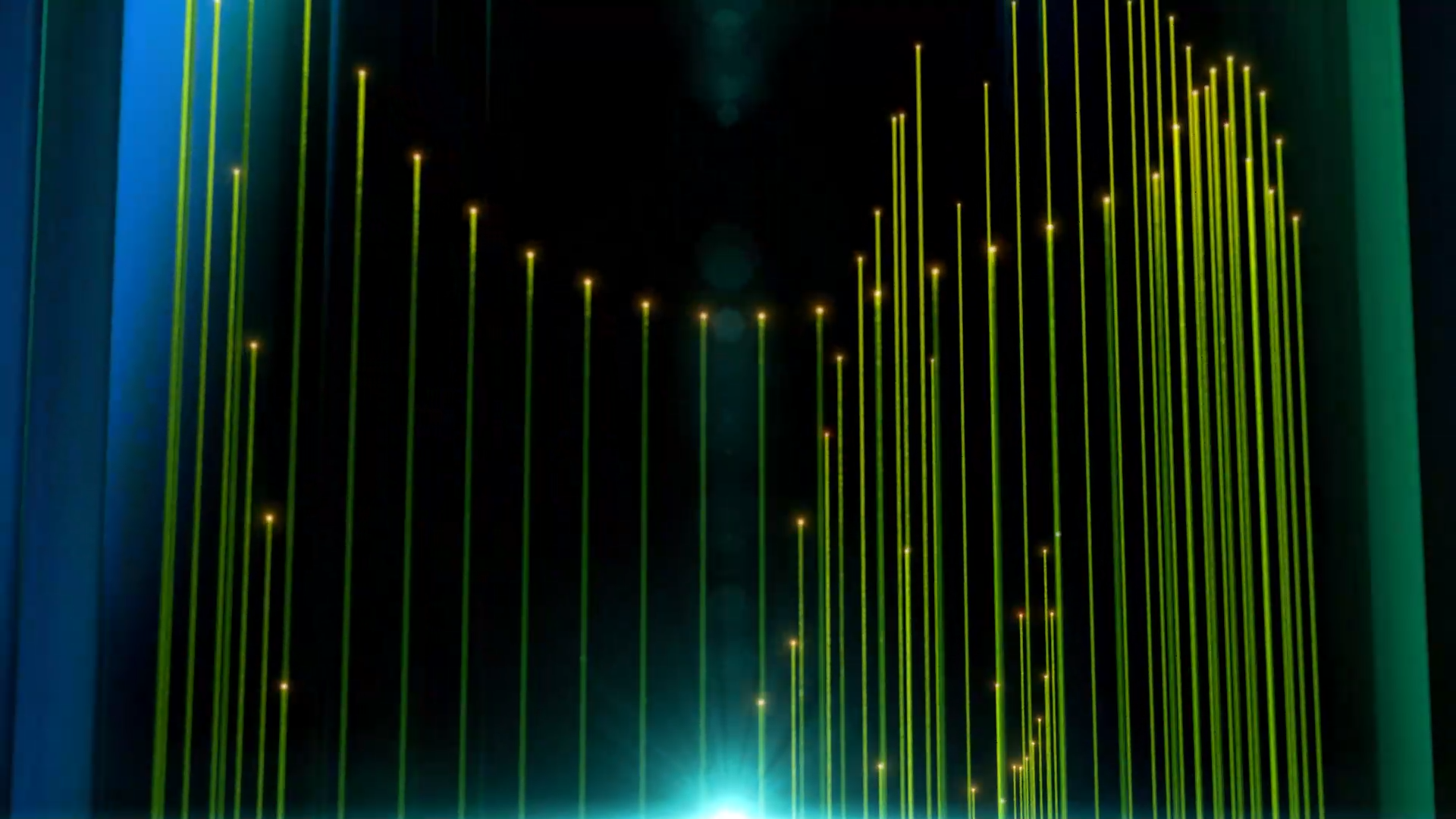
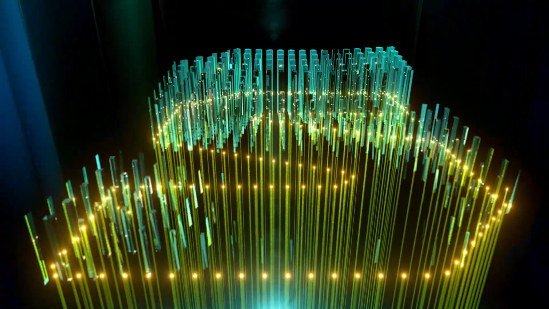
Worked on the line and dot concept
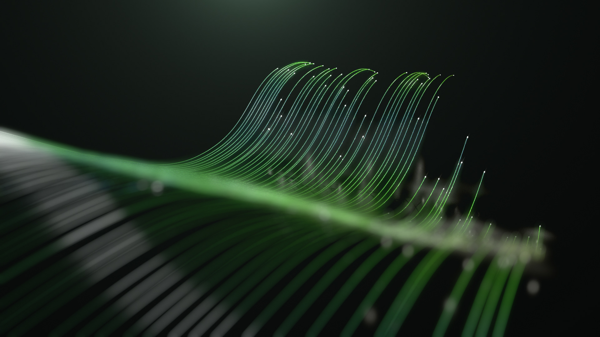
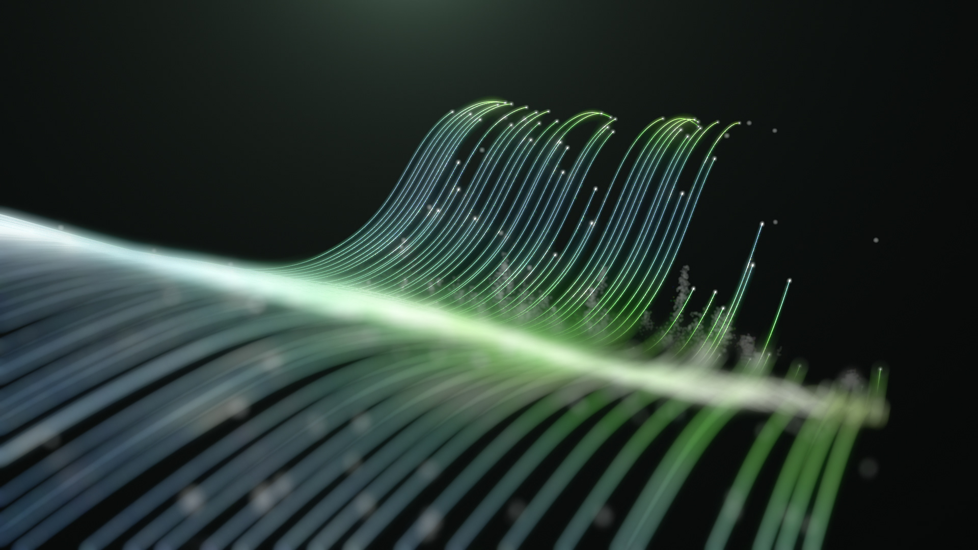
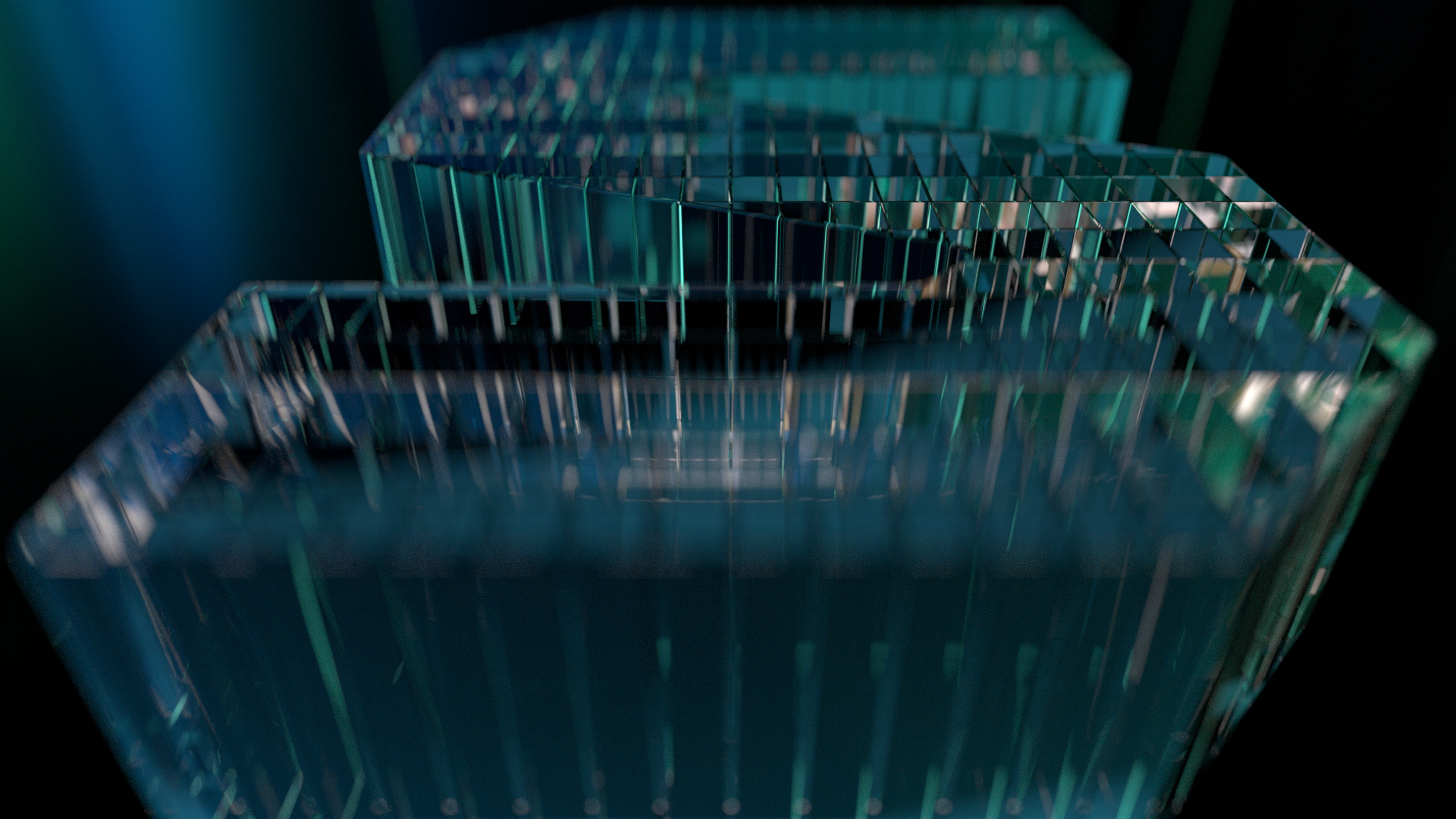
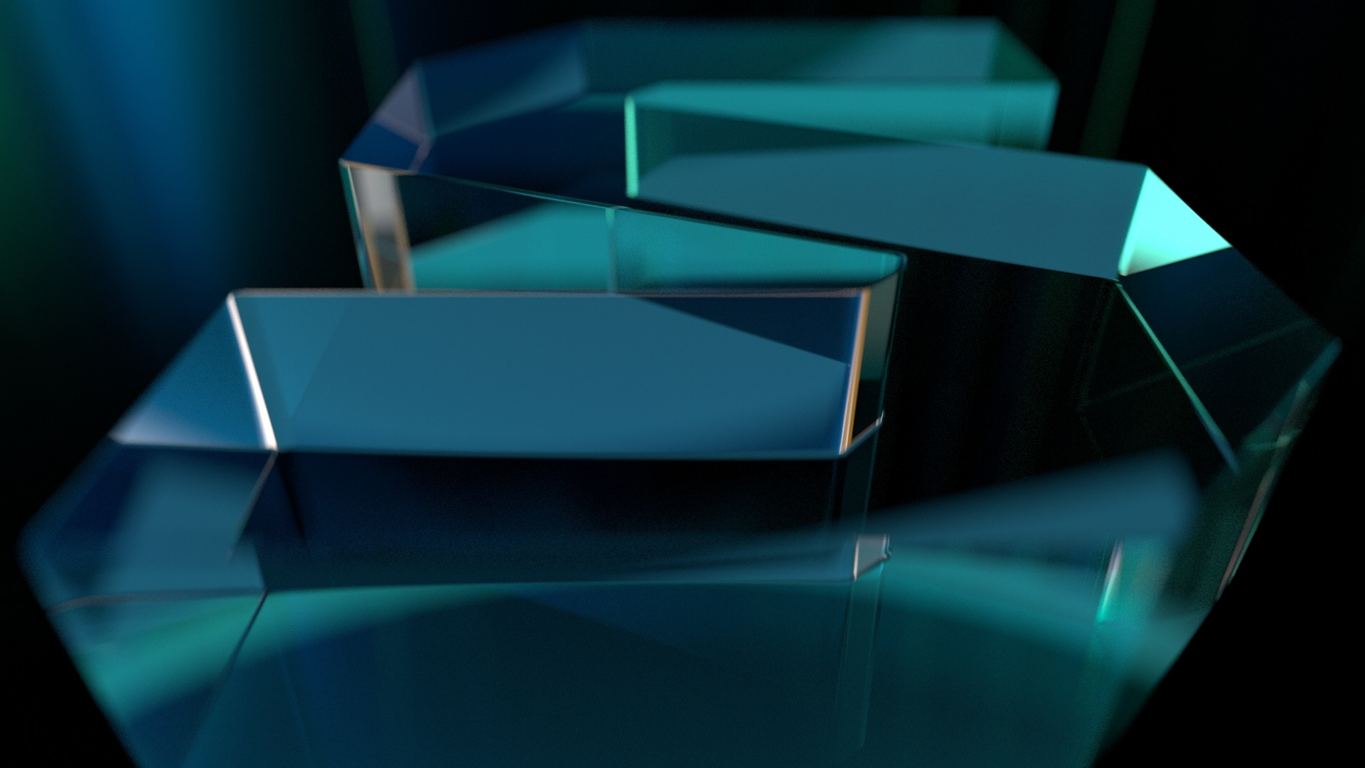
Letter S Formation
Animation Tests for lines and dots
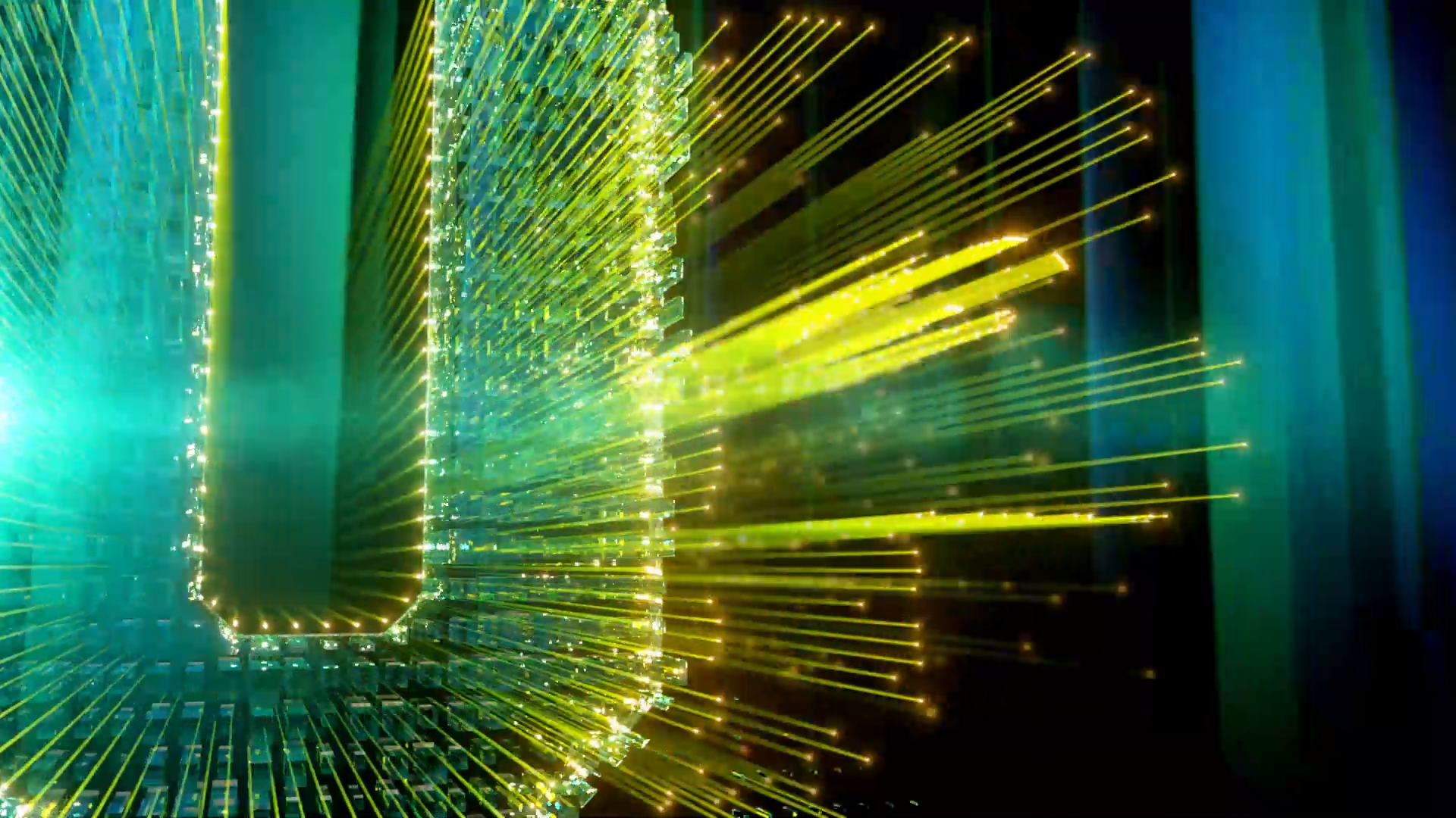
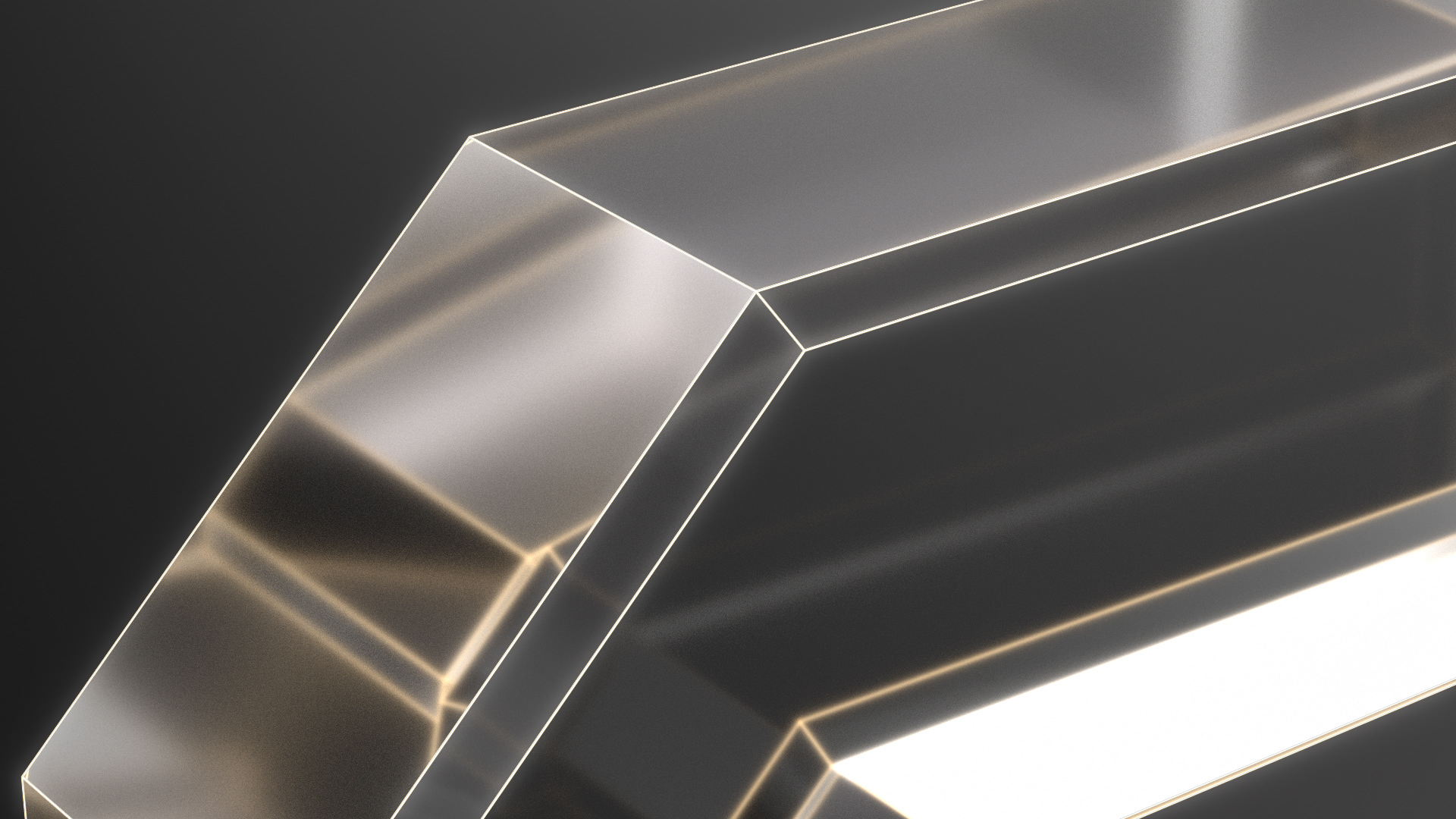
Lines test with glass interaction
Logo Bug Animation Tests
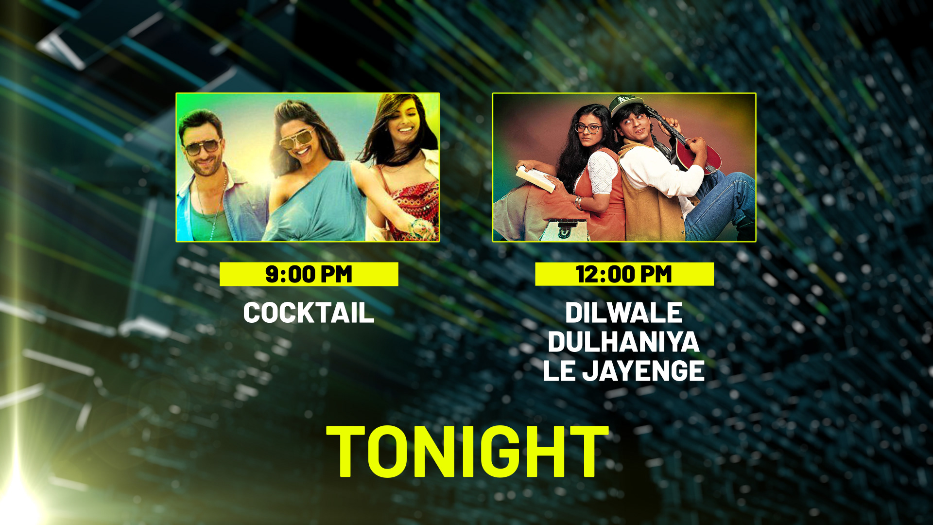
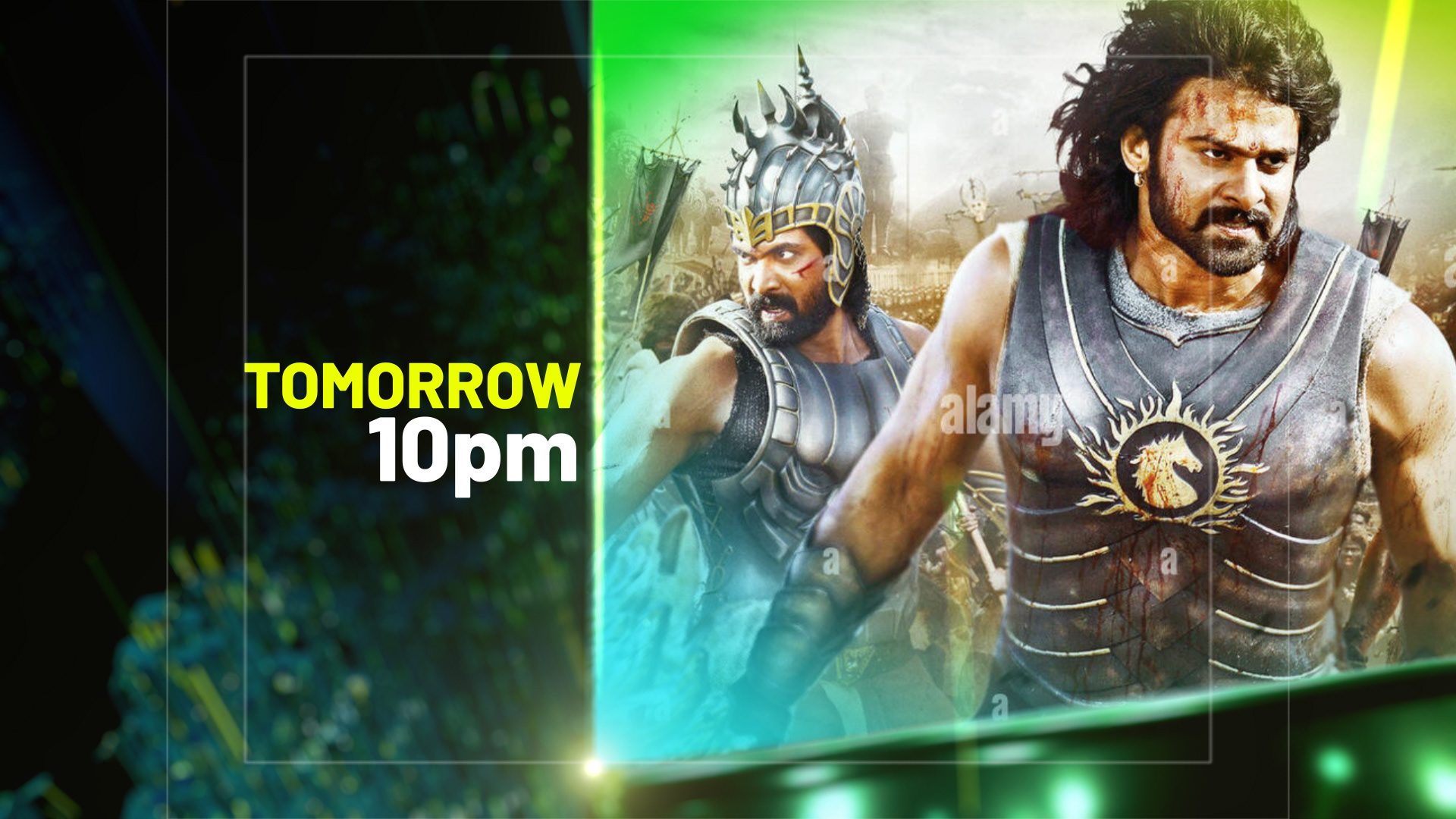
Back in Window
Sponsor Window Test
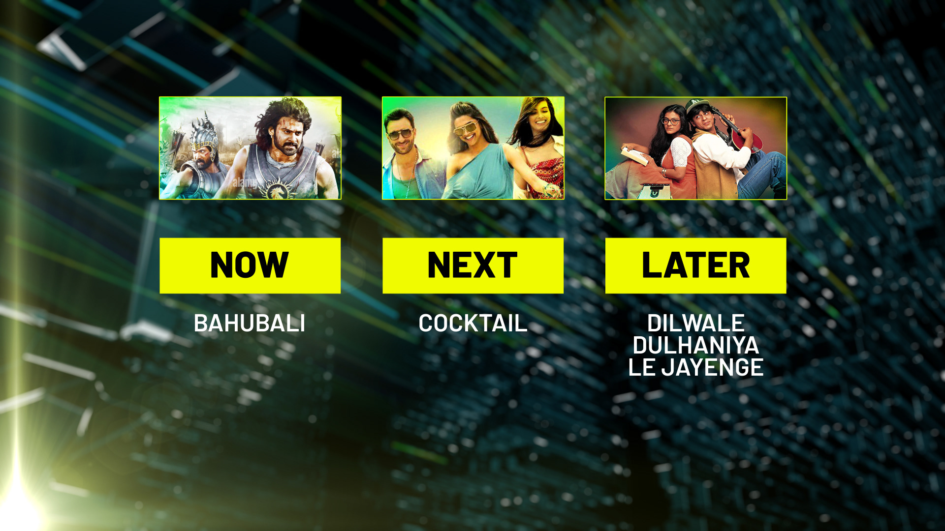
Double & Triple Bill Designs
Other Ideas for letter formation and looks
Thank you!